Telefónica O2 · Apr–Nov 2020
Flexi Pay
Launching flexible payment options for O2 customers.
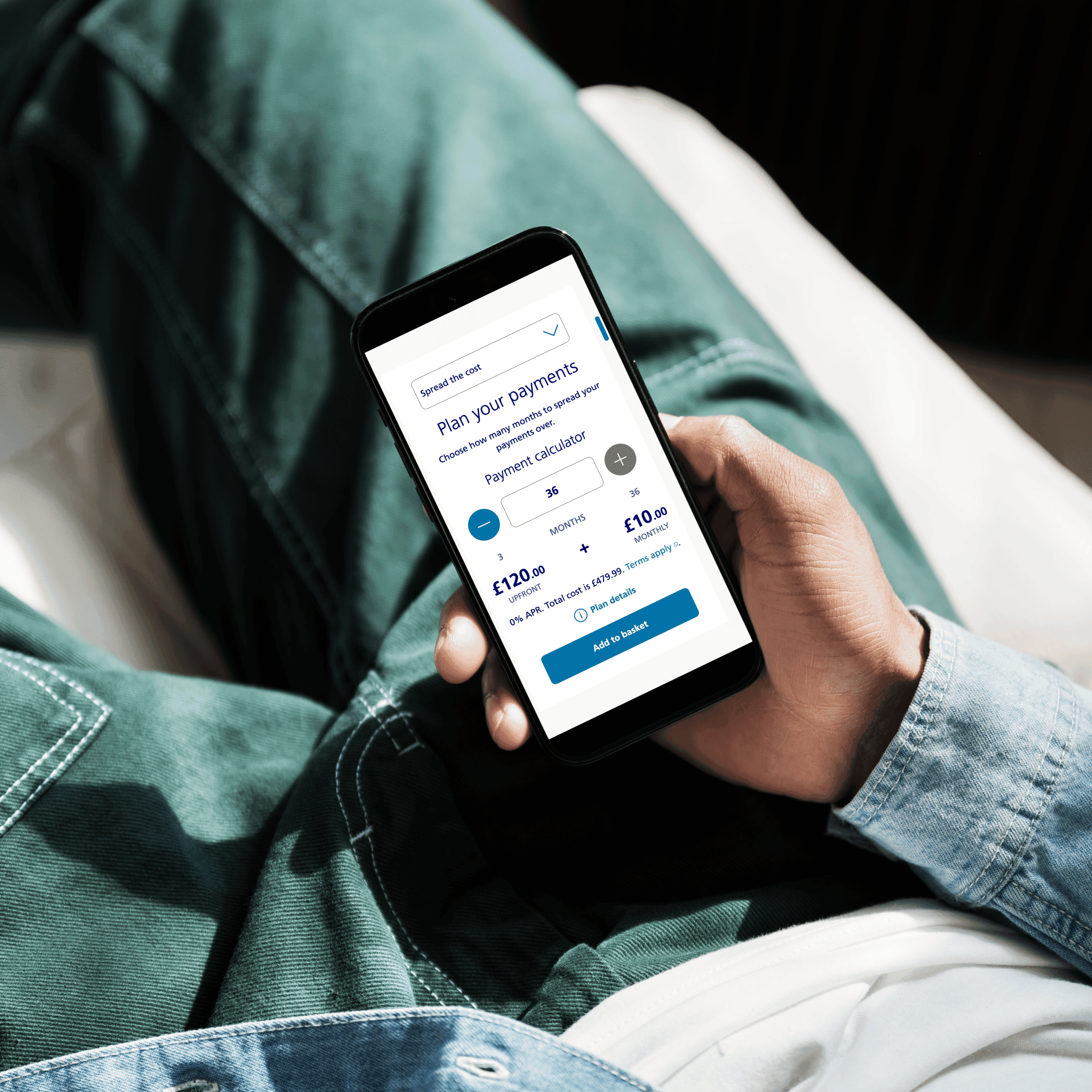
Outcome
25+Research experiments to validate the design.UCD in practice with UserZoom.
- Role
- UXD Consultant
- Product
- Ecommerce
The brief
Enable customers to purchase hardware and accessories by paying in monthly instalments, interest-free.
Situation
I worked client side for VCCP on their O2 Telefonica account. After delivering several projects I was assigned to another known internally as 'SIM Free Financing' (SFF).
Problem
Customers were not able to buy devices or accessories on finance as they expected. This was considered by the business as lost revenue opportunities.
Goals
Enable customers to purchase hardware and accessories by paying in monthly instalments, interest-free.
My Role
- Defined user stories.
- Established effective ways of working with other specialists.
- Wire-framed solutions and turned these into clickable prototypes (Sketch + Invision).
- Ran remote unmoderated usability testing, card sorting, and surveys with UserZoom to help steer decision making.
- Presented weekly updates to the wider business to share progress and learnings.
- Wrote functional user stories to accompany the designs for handover to the development partner.
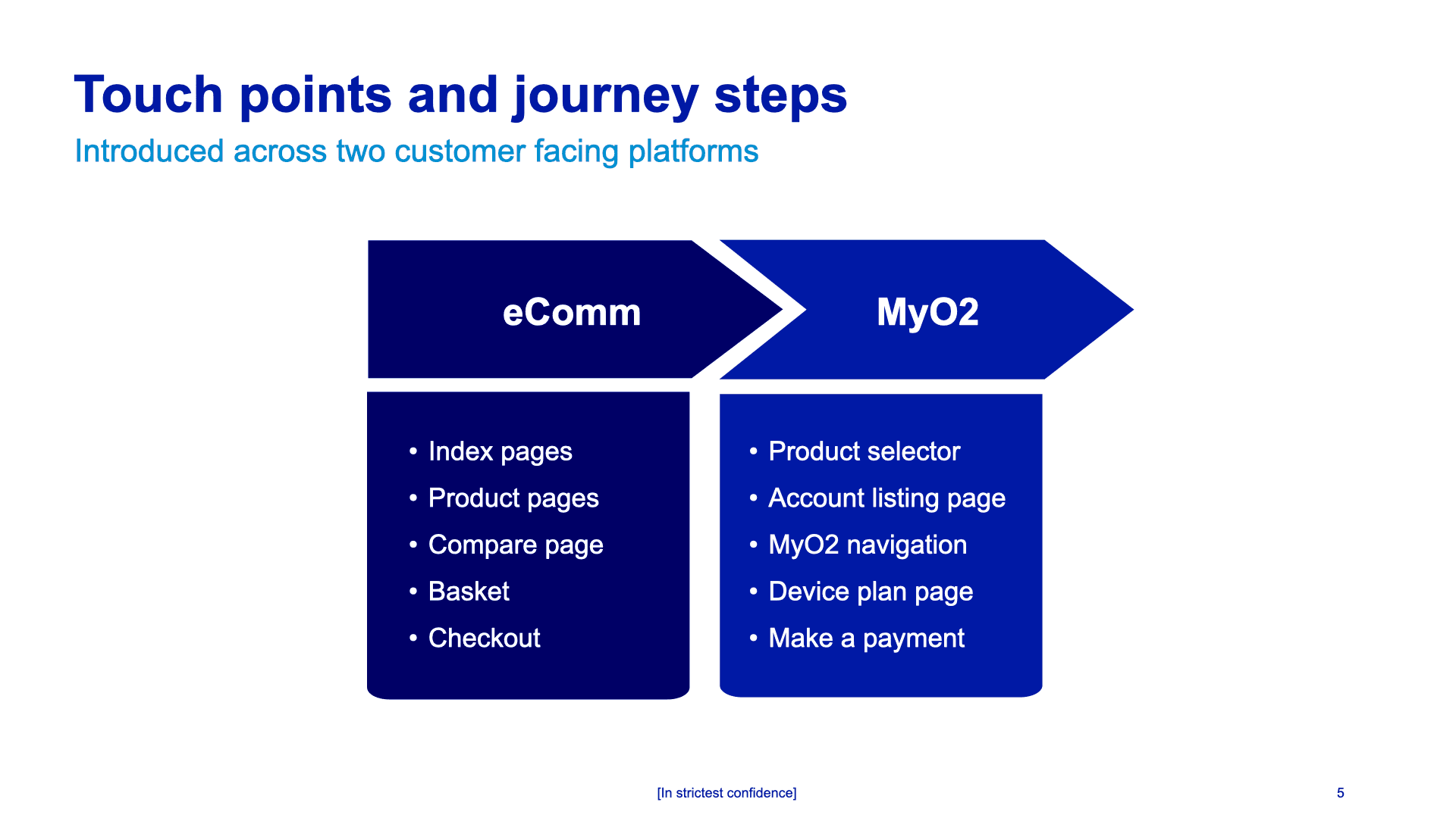
The business recommended where the SFF proposition should be included, both on the O2 E-commerce store and in account management.
Complication
What had to be overcome to deliver on time/budget:
- Stepped process the main contributors: UX, UI, and copywriting would pick up from where the other left off.
- Waterfall approach discovery, research, and design had to be handled before engaging with engineers.
- Research methods had to be robust and reliable due to the delivery method.
- Functional user stories to accompany UI designs during handed over.
- Working client side for a creative agency. Satisfying internal and external stakeholder requests/preferences.
- COVID Pandemic which meant our collaboration, communication, and relationship-building skills had to be on point.
Outcome Expectation
Due to project management adopting a Waterfall methodology, having reliable research to help inform the design direction was crucial to success of this project. If the research methods were not thorough or reliable, problems may have surfaced when the experience was released to customers.
Adding to this tight deadlines, the development partner had a short window of opportunity to pick up this piece of work, and therefore if the deadline was missed, release dates would be affected.
Remedial Action
Soon after the project kicked off, the COVID pandemic confined us all to remote working. We were quick to adapt and a few sprints in, I instigated a better way of working - UX, UI, and Copy worked in parallel rather than a stepped process.
Everyday was like a workshop
Miro, Teams, and UserZoom became our most useful tools. We ideated and agreed on how best to address users needs and validate any assumptions and solutions we arrived at.
Mapping out
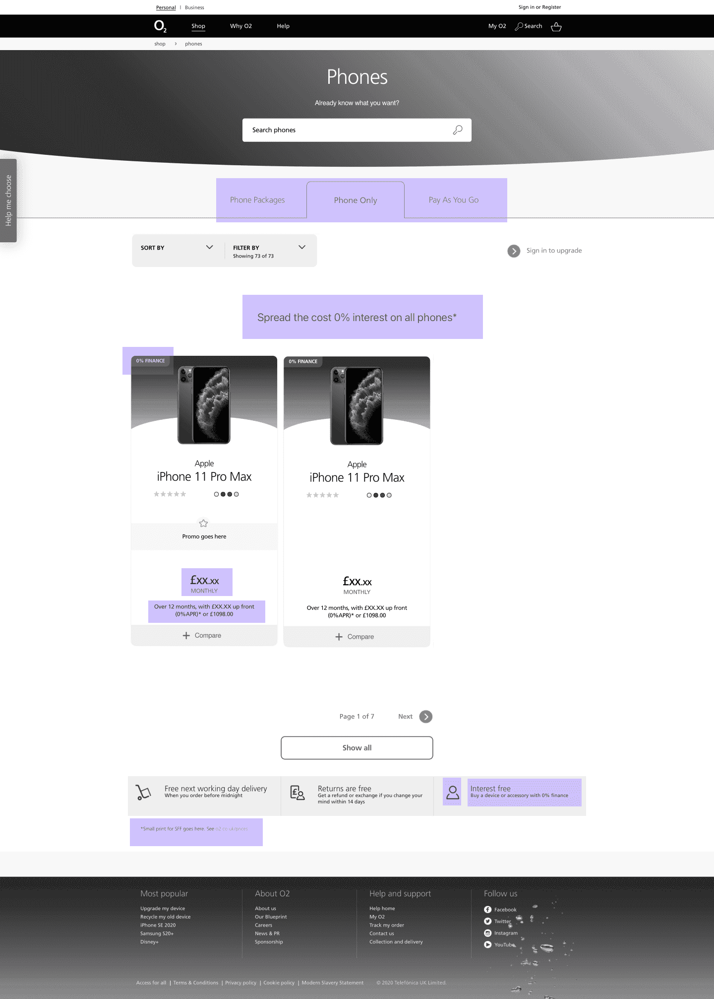
I Initially designed in the browser to show which aspects of the UI to adapt, in order to accommodate the new SFF proposition.
Designing components
Whilst it made sense to reuse existing components, we were given the freedom to prove if other patterns and components could be more effective.
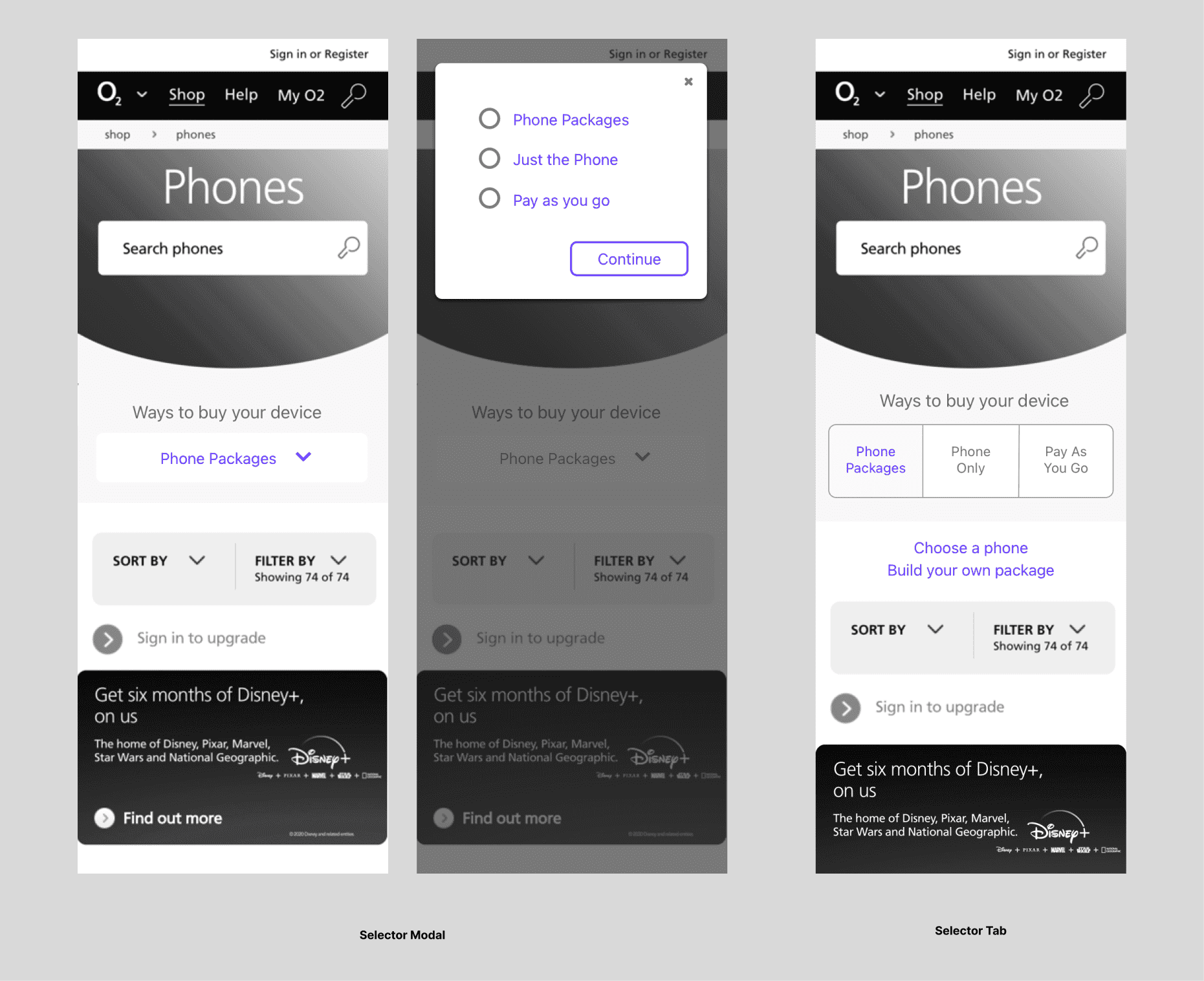
Two ways to select how to buy a phone, and introducing a Phone only option for paying in instalments.
Continuous Validation
To satisfy to need for reliable research, I continually ran tests in UserZoom to make sure our ideas were well validated, and we could be confident in the experience we handed over.
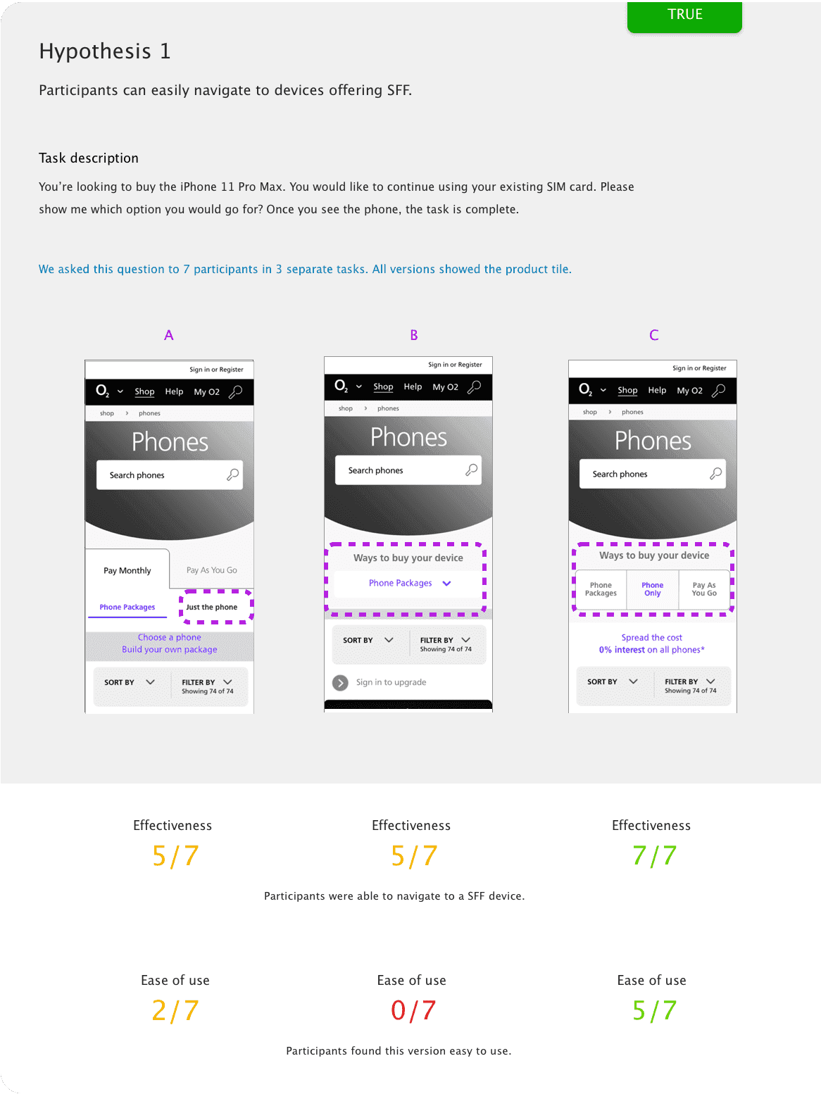
Three ideas we tested, variant C performed the best, which influenced the final UI.
Best selection experience
During the discovery phase, we explored different ways for customers to select a preferred payment term.
An existing component was adapted, and 2 other methods were designed to understand which was most effective and efficient.
Merchandising
I believed how pricing was displayed on product tiles could be the difference between making a sale and loosing one.
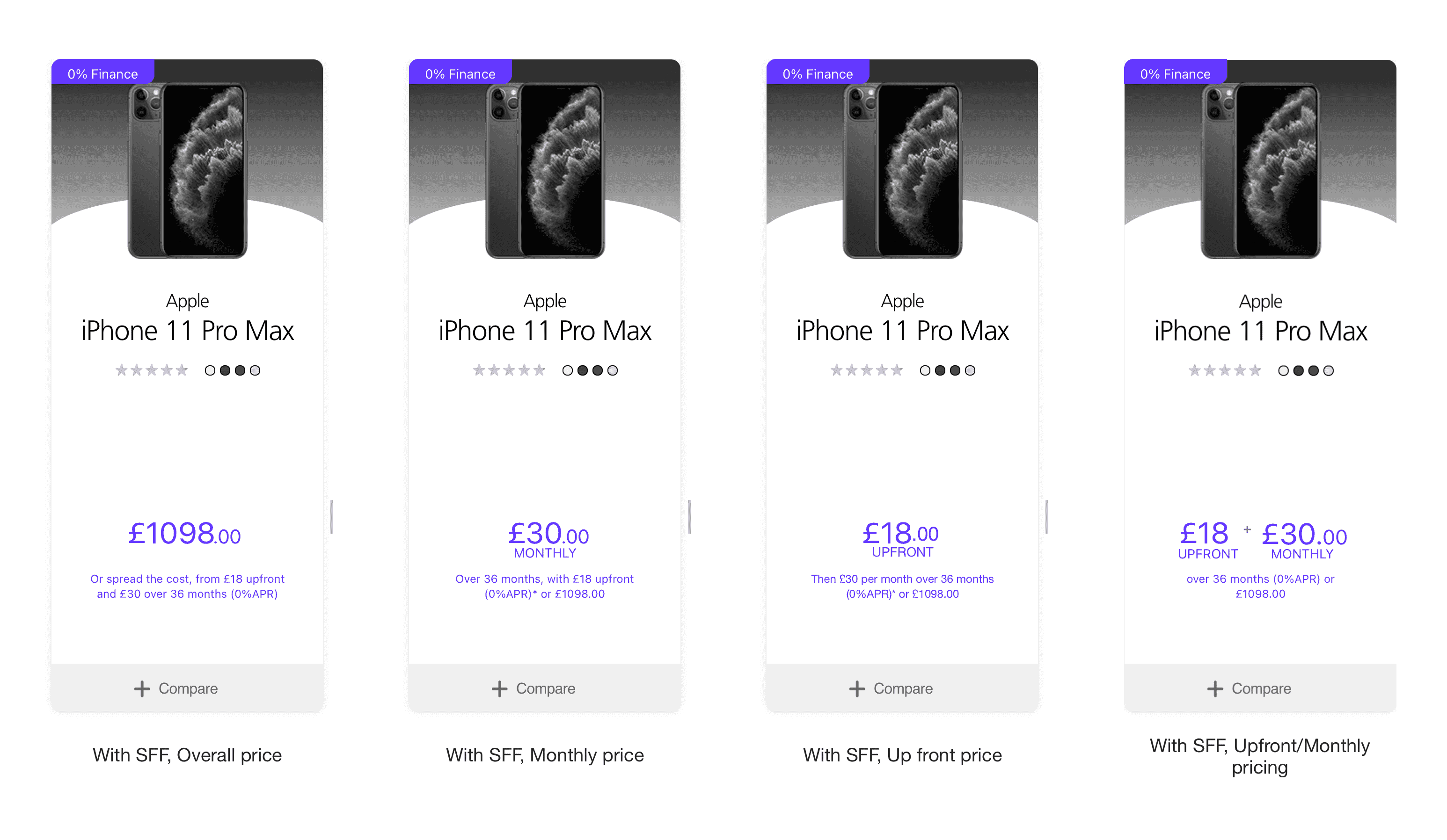
We explored various ways to present pricing information on product cards which we tested.
And the winner is…
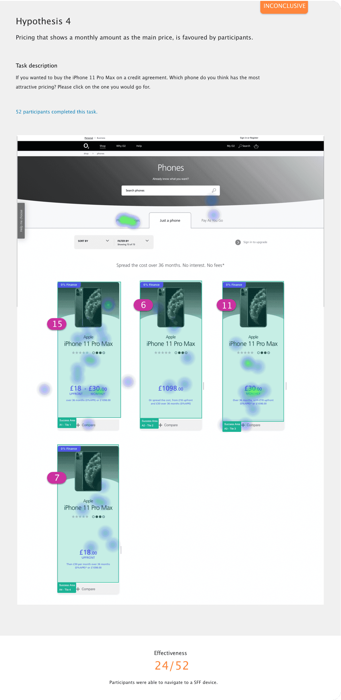
52 participants were asked which pricing they found most attractive. The majority were in favour of the upfront amount + the monthly payment. We went with this version, as it matched the pricing format for pay monthly contracts.
A Need/Limitation
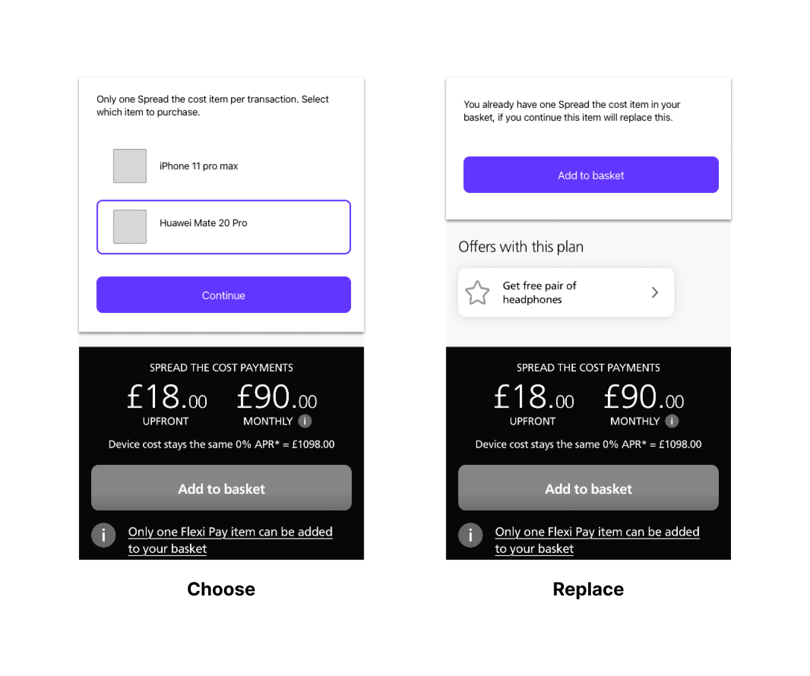
Designing around a constraint where only one item at a time could be purchased on finance.
Naming the proposition
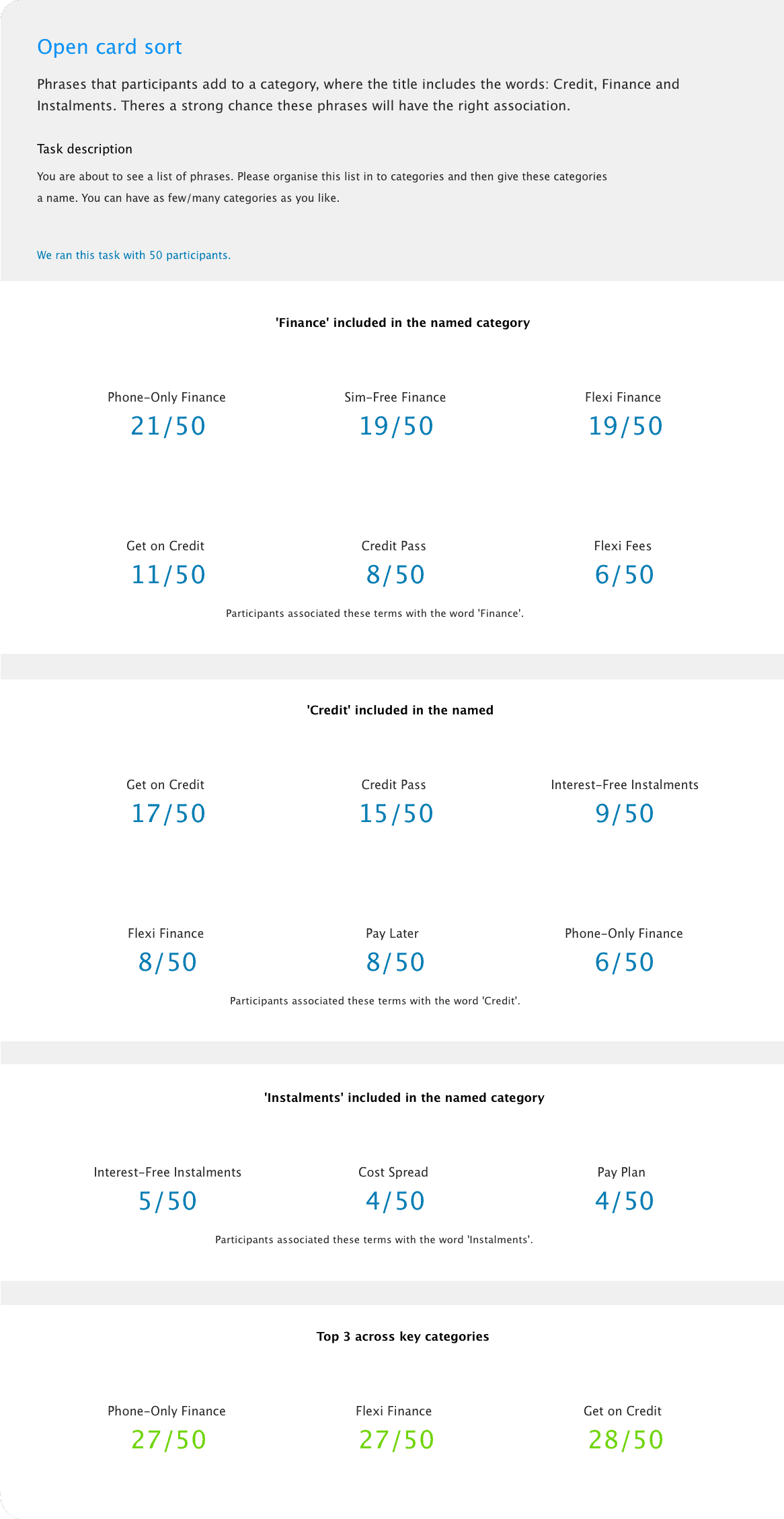
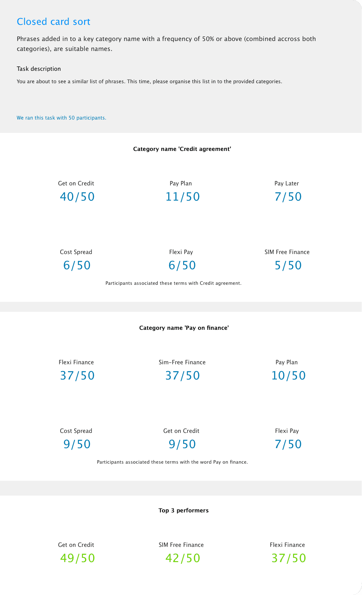
Our copywriter crafted a bunch of potential names for the proposition. Open and closed card sorting research was used to find phrases with the closest association to purchasing on credit.
Open Card Sort
Closed Card Sort
Research was used at every step to mitigate risk.
[Given] [When] [Then]
UX was required to write functional user stories in the Gherkin format for every aspect of the integration. This had to be packaged up with the designs ready for handover to the development partner. Overwhelmed at first, I welcomed the challenge and saw it as an opportunity to boost my knowledge.
End Result
The success of this project relied heavily on the quality of our research. We ran somewhere in the region of 25 unmoderated tests in UserZoom, giving us confidence that what we were handing over, would have the best chances of success.
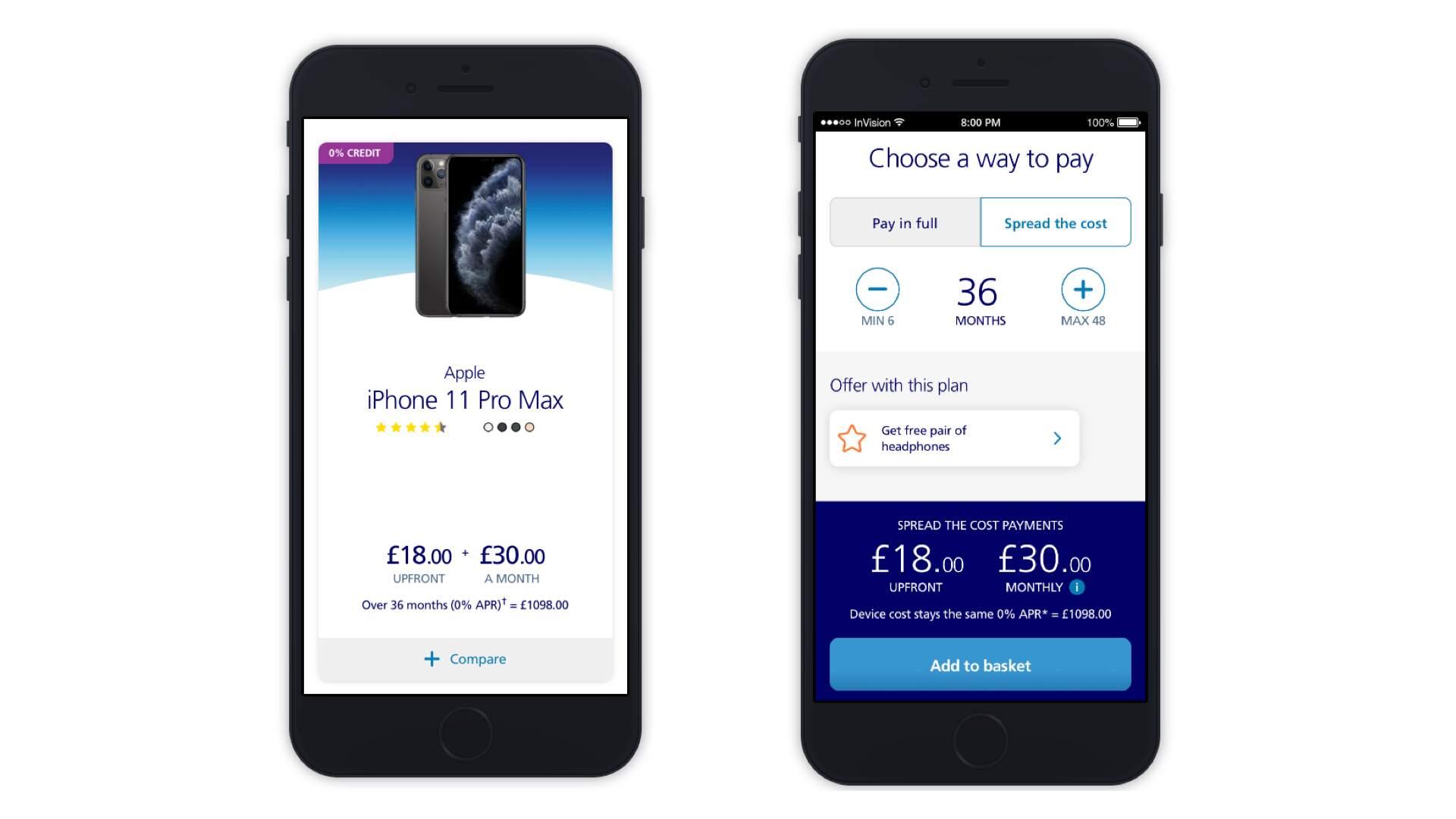
Mobile version of the product page
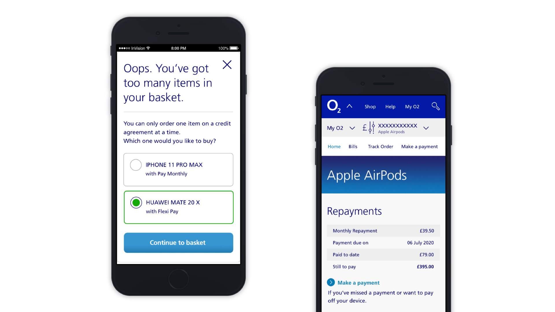
Mechanic to prevent 2 items from being purchased on credit and online account management.
Click-through prototype of the product page on desktop.
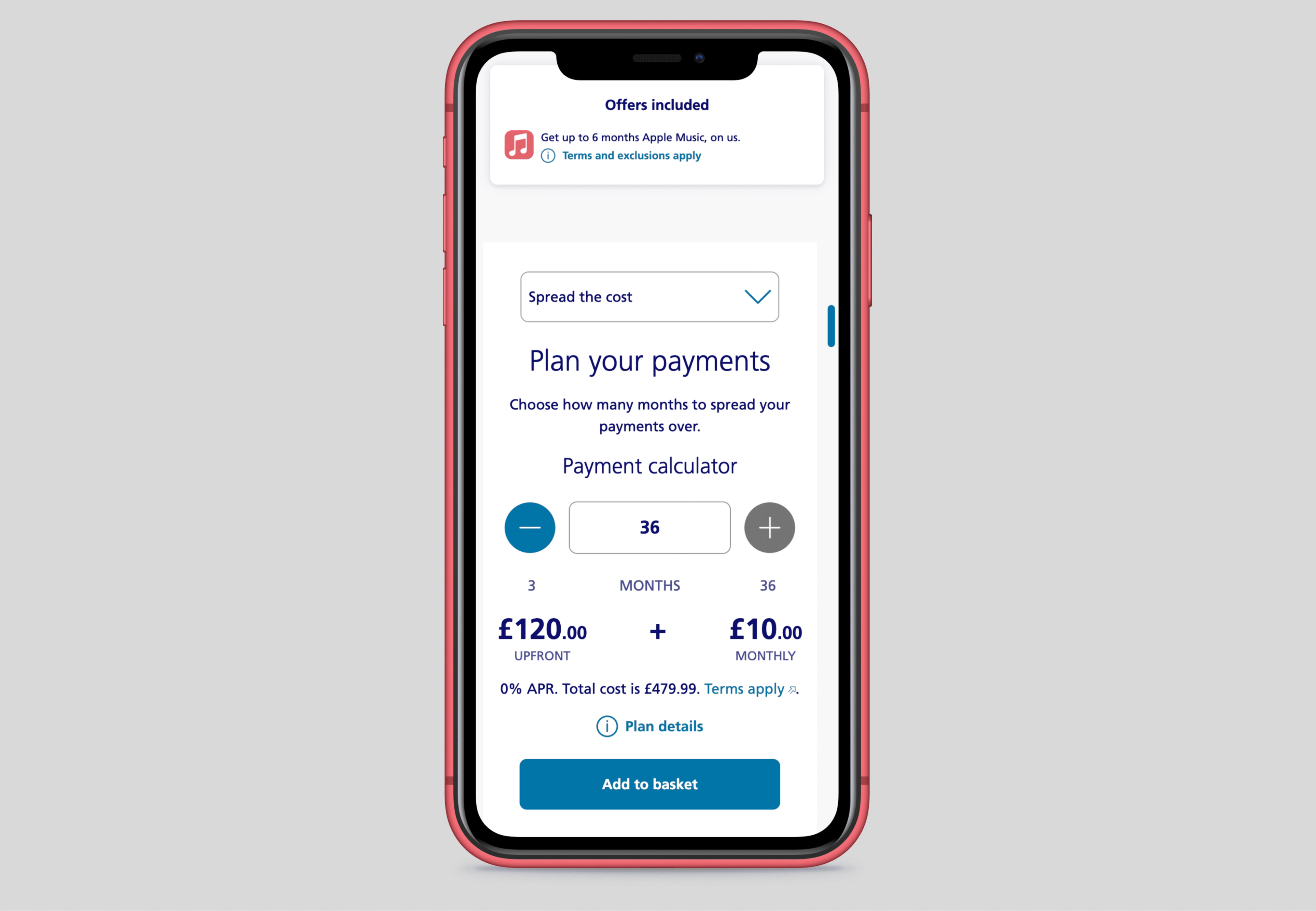
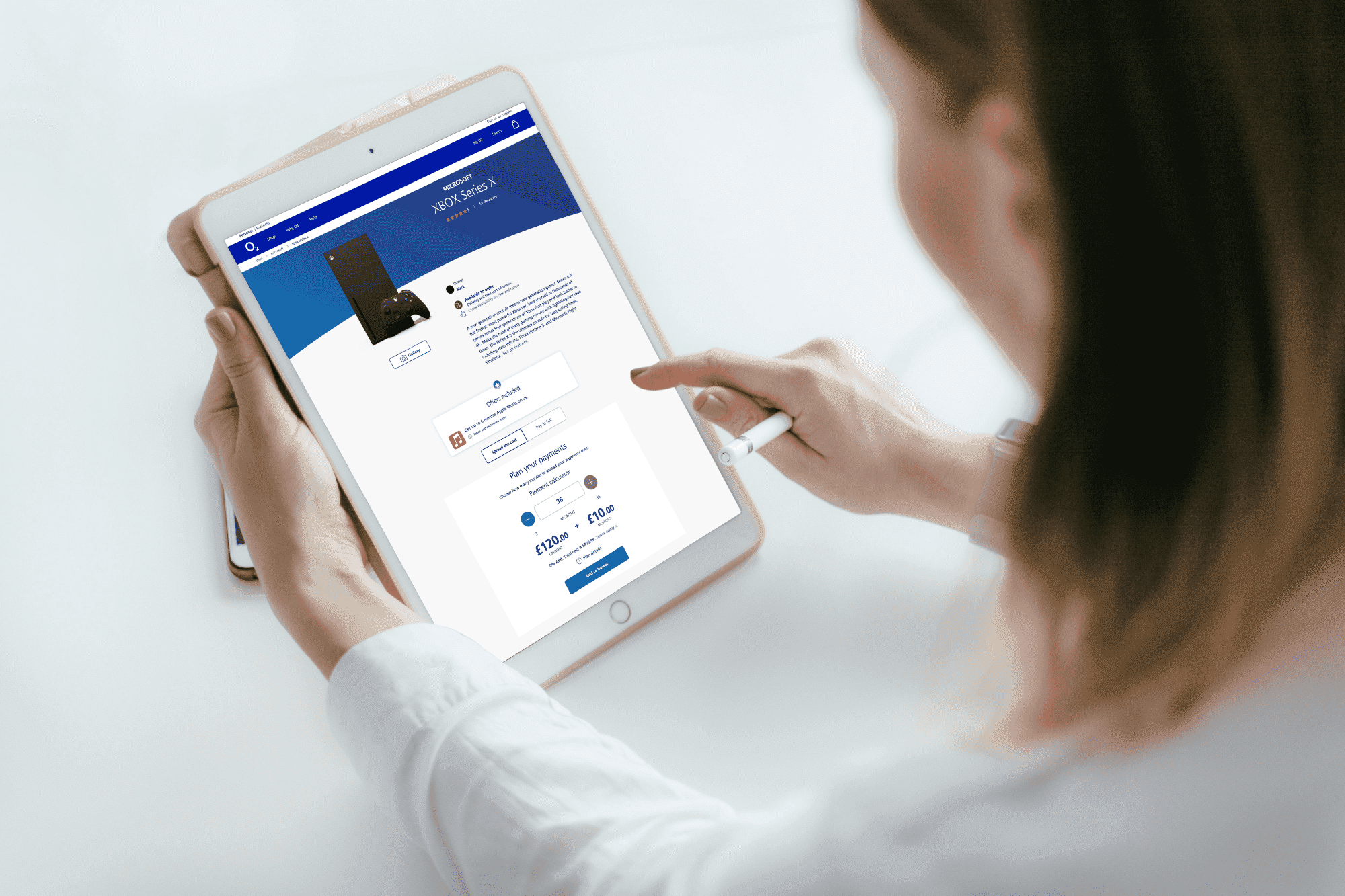
The solution 4 years on.
Value added
- Changed how creative worked together to share knowledge and overlap.
- Ran 25+ tests in UserZoom to validate assumptions and UI decisions.
- Captured all functionality in user stories written in the Gherkin format.
- Handed over user-centred designs on time and on budget.
“Dean was an amazing senior UX designer in my team at O2. Dean had a passion for UX and user testing, and he impressed me with his knowledge and experience in the field. He was always dependable, helpful, and collaborative, and I enjoyed working with him. Dean delivered outstanding work on high-profile projects at O2, such as the launch of the O2 Extras service, which offers customers access to various entertainment and lifestyle benefits, and the improvement of the O2 website accessibility. He had superb stakeholder management skills and was able to communicate effectively with clients, developers, and other designers. He always met the deadlines and the budget with high-quality work. Dean also contributed to the team and shared his knowledge. He organised workshops, presentations, and mentoring sessions to teach others about UX best practices, tools, and methods. He was very friendly and a pleasure to work with, and he always brought a positive energy to the team. I highly recommend Dean for any UX design role, as he is a brilliant, skilled, and professional designer who can add value to any organisation. He is an asset to any team and I wish him all the best in his future endeavours.”
Seema Chapaneri
Head of UX, O2 Telefonica
Available now
Surrey, UK
Remote across the UK and EU, on site in London and the South East. Inside and outside IR35.